


As an entrepreneur, I hear a lot of things said about good design<http://www.entrepreneur.com/topic/design>: Good design is simple. Or it's all about white space. Others say good design is understated or that it's hard to describe.
As a designer, though, I can tell you that while all these things are important, the main difference between well-designed pieces and poorly designed ones is something else entirely: having really good fonts.
Don't believe me? Take a look at what Squarespace's website would look like using Impact instead of its fancy, premium font.
Before:
[http://assets.entrepreneur.com/article/1412726334_1.jpg]
After:
[http://assets.entrepreneur.com/article/1412726352_2.jpg]
See the difference? Even with all the right spacing, simplicity and craft of the page design, the wrong font can leave the entire site looking amateurish.
Choosing the right fonts for a project is crucial. But when a premium font costs $60 to $200, it can be hard to justify the purchase. So what can you do?
Great fonts (like most excellent things on the Internet) are generally handcrafted by independent designers. Making a font takes an incredible amount of effort, which is usually reflected in the price tag. On rare occasions, though, kind and generous designers will give out a few fonts for free, as a way of advertising the rest of their collection. If you like any of the fonts below, please consider supporting their creators.
I've compiled the following list of 25 must-have free fonts for entrepreneurs, designers and anyone else looking to impress. Enjoy!
Related: Where to Find Free Photos and Never Again Pay for a Website Image<http://www.entrepreneur.com/article/237060>
Langdon
[https://m1.behance.net/rendition/modules/59376319/disp/fd8c49404528320837e0287b1f2922df.jpg]<http://www.xlntelecom.co.uk/business-resources/download-the-free-langdon-font/?callwinid=78888&affl=awin&awc=5413_1412696695_d11b88c33f2b75c976cf7e84d9c09909>
Langdon<http://www.xlntelecom.co.uk/business-resources/download-the-free-langdon-font/?callwinid=78888&affl=awin&awc=5413_1412696695_d11b88c33f2b75c976cf7e84d9c09909> is a friendly, easy-to-read font that works well in headlines and combines nicely with cursive typefaces.
________________________________
Vincent
[Vincent]<http://dribbble.com/shots/868554-Free-Typeface-VINCENT>
With strong characters and some creative shaping, fonts like Vincent<http://dribbble.com/shots/868554-Free-Typeface-VINCENT>are perfect for businesses seeking that serious yet approachable feeling.
________________________________
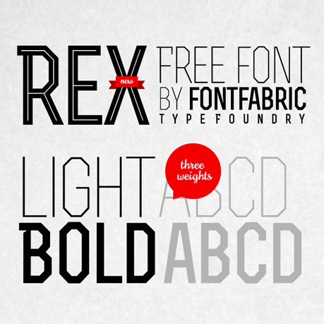
Rex
[http://www.awwwards.com/awards/images/2012/05/rex_font_2.jpg]<http://fontfabric.com/rex-free-font/>
Sharp angles and a selection of three weights make Rex<http://fontfabric.com/rex-free-font/> a font that works brilliantly in logos and paragraph headings.
________________________________
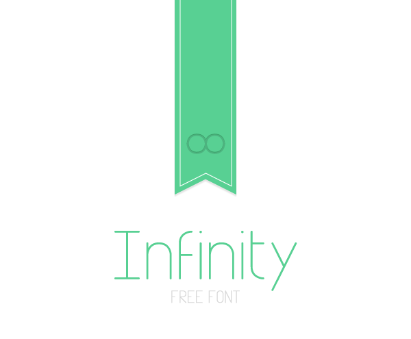
Infinity
[https://m1.behance.net/rendition/modules/7633779/disp/8dc87584a16830f041641cb6a18fb9a2.png]<http://www.behance.net/gallery/Infinity/1126535>
Infinity<http://www.behance.net/gallery/Infinity/1126535> is a thin font with a friendly yet sophisticated feel. Understated fonts like these work brilliantly for startups in industries that involve consumer interaction, such as health and wellness companies.
________________________________
Adam
[http://i0.wp.com/theultralinx.com/wp-content/uploads/2014/03/c1efddffeac8786b634f6713feb5f435.jpg?resize=600%2C293]<http://www.behance.net/gallery/ADAM-Free-Typeface/13756975>
Modern, bold fonts like Adam<http://www.behance.net/gallery/ADAM-Free-Typeface/13756975> are easy to read and work well for website headings and navigation bars.
________________________________
Nougatine
[https://blogger.googleusercontent.com/img/b/R29vZ2xl/AVvXsEhoQLCa1t0CDfb5bPLA3EI29cCuXQCRWdGNySlwXgfK3UIGfGt-JbFELEDbgtzYYGIfqMWtt0_R-Wp06k4tT9R6BCPZUnBc2a9VHe3UAuUIHxTO1uUaCVYabyh2J2mRxOK07Xql/s1600/free_font_nougatine.jpg]<http://www.behance.net/gallery/nougatine-free-font/3481787>
Nougatine<http://www.behance.net/gallery/nougatine-free-font/3481787> is a unique, retro-inspired font that combines strong capital letters with some creative cut-out shapes.
________________________________
Silverfake
[http://fontfabric.com/wp-content/themes/unstandard/images/silver3.jpg]<http://fontfabric.com/silverfake-free-font/>
If you've ever looked for retro fonts, you know that good ones are few and far between. Silverfake<http://fontfabric.com/silverfake-free-font/> is the exception. Legibile but with an authentic retro feel, it combines nicely with modern, bolder fonts, such as Adam, above.
________________________________
Code Pro
[http://fontfabric.com/wp-content/themes/unstandard/images/codepro_07.jpg]<http://fontfabric.com/code-pro/>
Code Pro<http://fontfabric.com/code-pro/> is a designer's dream. It comes in lots of of weights (thin or heavy) and a variety of styles. The versatile font fits into just about any design, whether for the website of a tech startup or a restaurant menu.
________________________________
Raleway
[https://d22lct1myh0s5f.cloudfront.net/images/raleway-1.jpeg]<http://www.theleagueofmoveabletype.com/raleway>
Want to know a designer's secret? When aiming to create something that feels sophisticated, look for the thinnest font possible. Few are thinner than Raleway<http://www.theleagueofmoveabletype.com/raleway>.
Raleway is a popular font that comes in a myriad of sizes, ranging from hairline thin to bold black, making it a mighty useful font for a variety of company branding functions.
________________________________
Montserrat
[https://s3.amazonaws.com/FreebiesXpress/Blog/4-Top-Google-Fonts-Vol-2/Montserrat.jpg]<http://fontpro.com/montserrat-font-16367>
Montserrat is the ultimate modern font: It pairs brilliantly with stick-thin fonts like Raleway and looks beautiful when laid over a high-resolution background image.
________________________________
Droid Serif
[Droid+Serif]<http://www.google.com/fonts#UsePlace:use/Collection:Droid+Serif>
Droid is the ideal font for long blocks of text: It's easy to read and has just the right mixture of soft and hard serifs to give it a unique personality all of its own.
________________________________
Domine
[http://fontpro.com/font-display/domine_35565.png]<http://www.google.com/fonts#UsePlace:use/Collection:Domine>
Looking for a classic font that's like Georgia or Garamond? Domine<http://www.google.com/fonts#UsePlace:use/Collection:Domine> is the perfect alternative. It's bolder than the typical paragraph font, making it suitable for big, eye-catching headlines.
________________________________
Franchise
[http://www.dafont.com/img/illustration/f/r/franchise.gif]<http://www.dafont.com/franchise.font>
Illustration (c) Weathersbee Type<http://derekweathersbee.com/>
Franchise<http://www.dafont.com/franchise.font> is a friendly, bold display font that looks great on the web, particularly in infographics.
________________________________
Dosis
[http://il.static.1001fonts.net/d/o/dosis-font-3-big.png]<http://www.1001fonts.com/dosis-font.html>
If you're running a tech startup, you may have a hard time finding solid fonts to suit your purposes. Most tech fonts have a way of feeling too harsh for today's projects. Dosis<http://www.1001fonts.com/dosis-font.html> breaks the mold. With softer, rounded corners, it is a great alternative to traditional tech fonts. And it works well in nontech projects, too.
________________________________
Abel
[http://turbo.designwoop.com/uploads/2012/05/5-Google-Web-Fonts-Abel_1334647288001.png]<http://www.google.com/fonts#UsePlace:use/Collection:Abel>
Abel<http://www.google.com/fonts#UsePlace:use/Collection:Abel> is a nice mix between a tech font and a modern display face. Although only one weight of font is available, Abel can be a good choice for headlines and paragraph text.
________________________________
Odin Rounded
[http://absolutfoundry.com/wp-content/uploads/2014/01/Odin-image-2.jpg]<http://absolutfoundry.com/fonts/odin-rounded/>
Odin Rounded<http://absolutfoundry.com/fonts/odin-rounded/> is a Norse design-inspired retro font that works surprisingly well in tech-oriented projects.
________________________________
Lintel
[Lintel Free Font]<http://www.dafont.com/lintel.font>
Lintel<http://www.dafont.com/lintel.font>'s thin, strong features make it well-suited for high-end tech and fashion startups.
________________________________
Hagin
[http://fontfabric.com/wp-content/themes/unstandard/images/hagin04.jpg]<http://fontfabric.com/hagin-free-font/>
Try Hagin<http://fontfabric.com/hagin-free-font/> in your next retro-themed project. It can create bold headlines and its unique serifs set it apart from most classic fonts.
________________________________
Weston
[Frameless]<http://fontfabric.com/weston-free-font/>
Weston<http://fontfabric.com/weston-free-font/> simultaneously evokes a 1930s movie poster and a Wild West "most wanted" alert. Mix it with a cursive font or a thin, modern typeface.
________________________________
Roboto Slab
[https://s3.amazonaws.com/FreebiesXpress/Blog/4-Top-Google-Fonts-Vol-2/Roboto-Slab.jpg]<http://www.google.com/fonts#UsePlace:use/Collection:Roboto+Slab>
Roboto Slab<http://www.google.com/fonts#UsePlace:use/Collection:Roboto+Slab> is the font with a million uses, for both headlines and paragraphs. Heck, it even looks good in off-line publications.
________________________________
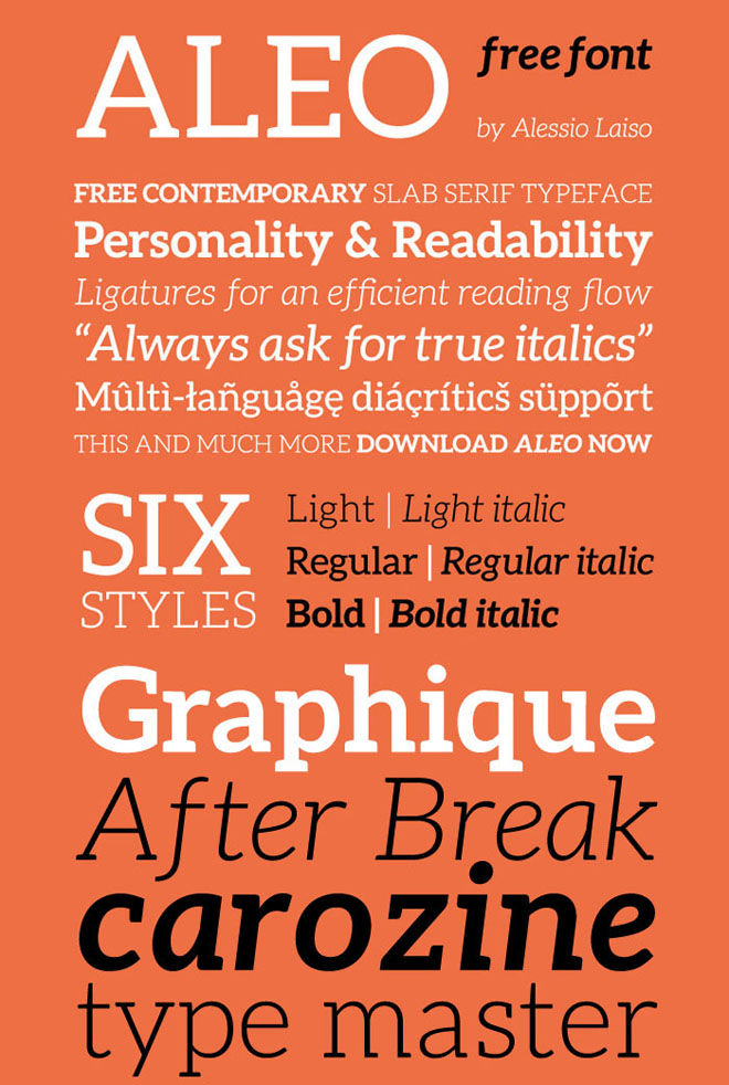
Aleo
[http://webneel.com/sites/default/files/images/manual/fonts/27/aleo-free-font.jpg]<http://fontfabric.com/aleo-free-font/>
Aleo<http://fontfabric.com/aleo-free-font/> is one of the most versatile free fonts I've ever encountered. It comes in six styles, all available in italics, so designers will have an easy time finding the right match for just about any project.
________________________________
Lora
[http://cyreal.org/wp-content/uploads/2012/07/lora-promo.png]<http://www.fontsquirrel.com/fonts/lora>
If you want your startup to be taken seriously, try Lora<http://www.fontsquirrel.com/fonts/lora>. It has a classic vibe and is incredibly legible even in very small sizes.
________________________________
Lato
[http://dawgeared.com/wp-content/uploads/2013/06/lato.gif]<http://www.fontsquirrel.com/fonts/LATO>
Lato<http://www.fontsquirrel.com/fonts/LATO> works hard for startups in pursuit of that friendly yet sophisticated aura. It pairs nicely with just about any serif font, such as Aleo and Lora.
________________________________
Calendas Plus
[http://www.calendasplus.com/images/muestra%20calendas%20plus-01.png]<http://www.calendasplus.com/index.html>
Calendas<http://www.calendasplus.com/index.html> is reminiscent of classic fonts like Garamond and Georgia but possesses a bit of a unique personality of its own.
________________________________
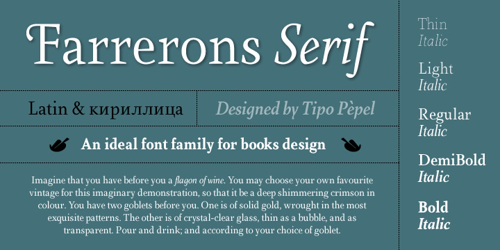
Farrerons Serif Light
[https://cdn.myfonts.net/s/aw/720x360/135/0/69199.jpg] <http://www.myfonts.com/fonts/tipo-pepel/farrerons-serif/light/>
Farrerons Serif Light<http://www.myfonts.com/fonts/tipo-pepel/farrerons-serif/light/> is an interesting typeface. For blocks of texts, it works as a reliable, legible font. In headings, it gives off a more creative vibe. Consider giving it a try in your next off-line print project.
Looking for more free, premium fonts? Check out Google's well-curated list of free fonts available via its Google Fonts<http://google.com/fonts> project.
Nenhum comentário:
Postar um comentário